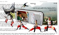
 Take a look at the picture to the left and notice how the advertising graphic totally obliterates the text that I was reading.
I had inadvertently cursored over the Nokia ad and when I tried to close it – by clicking “Close” button – the darned thing wouldn't close. Only by carefully cursoring to a section of the page that wasn't filled with irritating advertising graphic pop images was I finally able to read the rest of the article.
Really – is this necessary or just another way for advertisers to irritate web users? Your thoughts?