Here is a question that I received from one of our readers…
Hi Rosalind,
I'm really enjoying your new book, “Make a Fortune Promoting Other People's Stuff Online: How Affiliate Marketing Can Make You Rich“. I'm an experienced and somewhat successful dating affiliate myself, and I still have been able to find lots of useful information and tips in your latest book. Thank you so much for sharing!
I did want to mention that I believe there's a small typo on page 113 – second paragraph:
“the left side is read before the right side. Therefore, place your primary navigation on the RIGHT side” (Shouldn't it be placed on the left side?). Just wanted to mention this before your book goes into another printing.
Very enjoyable book. Thanks again for being so helpful and generous with sharing your knowledge!
Kind Regards,
Rhonda Ray
Thanks very kind for your question, Rhonda, and no, that wasn't a typo.
From a reader's perspective, I prefer to see content on the left and navigation on the right and that has certainly been the trend in site design for a number of years now.
Too, you want to place site navigation on the right hand side of your blog (or HTML pages) so that search engines read your site content before they get to the often long and always repeated site navigation links.
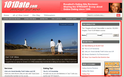
However, the simplest justification I can give for this is the way WordPress blogs and most WordPress themes are structured out of the box, with navigation on the right side. (see screenshot below of my 101Date.com homepage with it's StudioPress theme loaded and the primary navigation outlined in red).
WordPress blogs are known for their search-engine friendliness, which is due in most part to their dynamic nature.
However, because the WordPress designers are also so search engine savvy, I trust that their choice to typically place navigation on the right side has a great deal to do with enhanced visibility to the engines.
I say the right side. The left side should be left for content. Taking the Google Approach on this.
Such an informative blog for me. Thanks!
I have learned a lot from this article. Thanks.
Most popular blog as well as your blog Ros, use right hand navigation. Honest, I am pleased to read the contents on the left and navigation on the right.
In seo the navigation position does not matter much it is the link building which can get you high ranking.
With Google Scientific evidence proven that navigation bar should be on the right and not left. There is no right and there is no wrong, as long as it is not out of sight.
The inventors of eyetracking heatmapping.
——————————————————————————–
Eyetools Research and Reports
Google Search’s Golden Triangle
New EyeTracking Study verifies the importance of page position and rank in both Organic and PPC search results for visibility and click through.
A joint eye tracking study conducted by search marketing firms Enquiro and Did-it and eye tracking firm Eyetools has shown that the vast majority of eye tracking activity during a search happens in a triangle at the top of the search results page indicating that the areas of maximum interest create a “golden triangle.”
The first phase of the study was conducted with 50 people in Eyetools’ eye tracking lab in San Francisco, California and presented panel participants with 5 distinct scenarios that would require the use of a search engine. Google was used as the search engine in all of the instances.
Key Preliminary Findings of the Study
The key location on Google for visibility as determined by the eye activity in the study is a triangle that extends from the top of the results over to the top of the first result, then down to a point on the left side at the bottom of the “above the fold” visible results. This key area was looked at by 100 percent of the participants. In the study, this was referred to as the “Golden Triangle”. Generally, this area appears to include top sponsored, top organic results and Google’s alternative results, including shopping, news or local suggestions.
Visibility dropped quickly with organic rankings, starting at a high of 100% for the top listing, dropping to 85% at the bottom of the “above the fold” listings, and then dropping dramatically below the fold from 50% at the top to 20% at the bottom.
Organic Ranking Visibility
(shown in a percentage of participants looking at a listing in this location)
Rank 1 – 100%
Rank 2 – 100%
Rank 3 – 100%
Rank 4 – 85%
Rank 5 – 60%
Rank 6 – 50%
Rank 7 – 50%
Rank 8 – 30%
Rank 9 – 30%
Rank 10 – 20%
Eye scan and click through behavior changes dramatically as users moved “below the fold” to the section of results that required scrolling down. At the top of the page, the amount of eye movement declined rapidly through the top 4 or 5 results, and then at the bottom of the screen, tends to become more consistent through to the end of the page.
In searches where top sponsored results are returned in addition to right sponsored ads, the top ads received much higher visibility, being seen by 80 to 100% of participants, as opposed to 10 to 50% of participants who looked at the side sponsored ads.
On side sponsored ads, the top ranked results received much more in the way of both eye activity and click through. About 50% of participants looked at the top ad, compared to only 10% who looked at ads in the 6, 7 or 8th location on the page.
Side sponsored ad visibility
(shown in percentage of participants looking at an ad in this location)
1 – 50%
2 – 40%
3 – 30%
4 – 20%
5 – 10%
6 – 10%
7 – 10%
8 – 10%
There seems to be a “F” shaped scan pattern, where the eye tends to travel vertically along the far left side of the results looking for visual cues (relevant words, brands, etc) and then scanning to the right if something caught the participant’s attention.
These results come from an initial analysis of the results and were presented during sessions at the Search Engine Strategies conference in New York. While interesting, the study’s main findings are still to come and will required detailed analysis of individual behavior patterns.
Did It’s Kevin Lee said, “At this point, we weren’t too surprised at what we’ve seen in the study. We suspected much of this to be true prior to conducting it. However, there is tremendous value in confirming these suspicions, especially in a way that’s so visually compelling. It also proves that our methodology will hold up for phase 2 of the research. On the sponsored search side, data indicates that it is the clear branding and visibility advantage offered by gaining top positions, especially Google’s top sponsored links. Unfortunately, these aren’t always presented with a search. Google is a little fickle in this regard.”
Enquiro’s Gord Hotchkiss added, “We see a marked difference in how people say they search and what they actually do. Previous research had indicated that people were considered searchers and spent some time before choosing a link. The past few studies we’ve done, this one included, shows that there’s a huge importance placed on where the eyeballs end up on the page. Clicks happen pretty quickly. It just shows that search marketing is a real estate game. It’s all about location, location, location.”
Eyetools’ CTO Greg Edwards also commented, “Eyetracking is the enabling tool that fills in the gaps to understand why people click or don’t click — by quantifying what people consider before the decision to click or leave is made, companies can start to better anticipate and design to satisfy people’s needs. Applying this in the search results arena enables companies to better plan their marketing communication and increase conversions.”
This research is ongoing and the phase 1 results are highly encouraging. After further analysis is done, the results will be made available to the public through white papers. Further findings will be announced as they become available.
For more information about Eye Tracking or the study, contact Greg Edwards at contact@eyetools.com.
Sign up today for an Eyetools test, because people can’t click on what they don’t see™
Search Engines are known to read contents from left to right, top to bottom. Search engines love it when contents are found within the shortest duration. Thus you should put away navigation on the right sidebar and contents on the left.
This is a great subject with many replies ,and opinions one can take all of them and apply , they all make sense it just depends on what you are after ,
search engine ready , or use friendly. I like them on the left but it makes so much sense to have them set on the right of the content for search engine
purposes. Rosalind,I trust and highly respect your opinion so on the Right they go. Thanks
Ernesto`
Ditto — ever since I read that Google read context on the left first, I’ve always gone for themes and layouts on both Blogger and WordPress that offer context on the left, navigation on the right.
I have always placed the navigation on the left,are we speaking about blogs here ? as far as basic website go navigation on the left ,but I agree that wordpress is so search engine savvy.I like all the comments.Thank You.
The marketing term is the Gutenberg diagram or Gutenberg rule. It’s a concept which describes reading gravity, which is how those in the ‘western’ world read: left to right, top to bottom. The Gutenberg diagram splits up a page into four quadrants: the “Primary Optical Area” in top left and the “Terminal Area” on bottom right are the most powerful.
The Gutenberg diagram therorizes that the bottom left of a page will get the least attention as people scan a page. As web visitors scan and read, they end up in the lower right page area. The Gutenberg diagram works better on pages that are more balanced and symetrical. If you use highlighting and/or bolding, then those areas will attract more attention. This changes the way people scan or read a page. The extent it changes depends on many variables.
Heatmap analytics can show how it works on a page. Fascinating.
Rosalind,
What template are you using for this site, I really like the look of it!
Thanks in advance,
Bert
Nice Site. Who was your site Designer?
Ros,
I disagree.
I feel the navigation should be on the left side of the page.
When I go to a new site, the first thing I want to know is how to navigate through that site. It makes me more comfortable with the site. I have been writing user oriented computer programs since 1960. One thing I have discovered is that you must make the interface with the system as user friendly as you can. Part of that friendliness is putting the user at ease. One of the most frustrating things that can happen to you is not being able to understand the structure of the site.
Good timing with this post. I started a blog with goals to grow into making money online utilizing blogs. Thanks..
Richard
Hi Rosalind,
Talking about design merits, I wonder what your thoughts are on page peel type adds. My initial thoughts are that they are an inobtrusive way of extending page real estate and are therefore worth considering for advertising purposes.
I find however that for wordpress 2.7.1+ there are a number of issues to overcome, these seem to be related to flash .swf file display etc. Do you know of any that work.
Well, is not that simple. Having a right side navigation is a good choice in many situations.
I like that “left-to-right” user sequence that starts reading the main content on the left, and ends with a mouse going towards the scroll bar and wondering “and now, what else?”. When users find the links on their path, they tend to stay more on your site.
And yes, from a technical point of view, it is probably the simplest way to implement a good navigational structure in a WordPress based site.
But it isn’t the only way to implement a good site navigation. In fact, it depends on the specific factors of each site. When optimizing my customers’ websites, after thorough usability studies, I usually find surprising conclusions.
Putting these practical studies in a nutshell, the attention of most users tends to go to the headline in the “top center” of the page. And then, most users naturally navigate to the surrounding navigation column to check additional articles, products, etc.
I don’t want to get lost with the technical jargon, but you can place content first using a left navigation based template with no CSS hacks. For example, you could float your contents from right to left. So, if you do things well, left navigation would also be a search engine friendly solution.
You’d probably been wondering about succesful left navigation websites. A good example would be Amazon: these guys really know what they are doing in terms of user experience optimization.
So my point is that both, left and right column navigations would work perfectly. Right column navigation has become the most frequent blog style navigation, while I usually prefer left navigation schemes for other kind of websites.
But the truth is that what really works for each specific website depends on each specific website. Take a look at how your users navigate. Experiment. And use what is best for you.
Anyway, if you have a different point of view, I would love to hear your comments.
Regards,
E. Serrano.
This may apply to blogs, but for regular websites it has been proven that the navbar should be on the left.
Hi,
I read recently that by using heat maps of users eyes that the readers initial focus is on the top left of the page but an interesting comment was made that it also is where the search engine bots concentrate and look for changes to a web page or blog to re-index you site.
That could also be construed to mean that you shouldn’t put big pictures at the top of your posts as was done in your example above.
Food for thought, I can’t say I’m convinced but it is worth keeping in mind and perhaps a round of serious testing for real results. I think the right column is correct based on all I’ve seen and read and I personally like it that way.
One man’s opinion…
Phil
I agree that it sure helps SEO to have the main content come before the navigation in the HTML code but you can easily achieve the same effect using absolutely positioned divs and CSS. That way the navigation div is after the content div in the HTML code but using absolute positioning it can make it “look” like it’s to the left of the main content (or anyplace you want to put it).
And I still think the conventional approach is navigation on the left side. Take a look at the top 50 websites at Alexa and you’ll see most have vertical navigation on the left (and horizontal Nav too). That’s what people are used to seeing so that creates the “convention.”
I also think that navigation plays a critical role in helping people find what they are looking for. If they see from your navigation that you have “what’s in it for them” then they will stay longer and read more pages. Making the navigation one of the first things they see helps that to happen.
I believe that It has to do with the form as we are customed to read from left to right and the way we used to write from left to right. The content to the left is more natural and visually better accepted , at least in this part of the planet.
Best regards,
Julio Alarcon
I agree that the right side is the way to go. Makes finding the content more clear and removes distractions for the reader.
It’s real that majority of navigation on well known site is located at the right portion of the pages.
WordPress blogs are SEO friednly.
and one of the most important parts of SEO
is indexing. In order to get indexed, content needs
to be on the left and the navigation on the right
to assure proper indexing by the spiders.
Igor