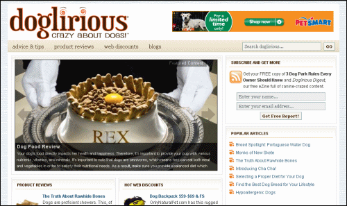
NOTE: Justin got too busy traveling around the world and writing books to maintain his site — but it's still a great story. 🙂
I found the Doglirious site through a link in our Forum and my first reaction was “WOW!”

SO impressed was I, that I emailed Justin (the webmaster) to find out if I could profile his site in the Super Affiliate Handbook as an example of how an affiliate site SHOULD be fleshed out.
When Justin replied with a little background about the site, I was even MORE impressed. Here's what he had to say:
Michelle (my girlfriend) and I adopted a dog from the Atlanta Humane Society about a year ago and ever since then, had been disappointed with the dog websites that existed. We were interested in reading product reviews from a website other than Amazon.com. Also, we were looking for reliable tips & advice that was fun to read (and sounded like it came from real dog owners). Finally, we wanted a central place to find online dog-product discounts from across the Web – but we just couldn't find a website that offered these elements in a user-friendly manner.
So, about two months ago, we began brainstorming about how to create a dog lover's website. One month ago, I bought your eBook, and with a lot of hard work, this project quickly blossomed due to our enthusiasm for the subject.
BRAVO!
Justin and Michelle started with exactly the right motivation and enthusiasm for building a business website. They saw the demand and went with the topic based on the fact that they're both completely ‘doglirious'.
LOVE that name – Doglirious.
The WordPress Theme
The theme Justin is using for the site is Brian Gardner's (Studio Press) Lifetyle theme. I asked him if they had an Elancer produce the graphics for the template or whether they designed them.
Other than Brian's theme and the WordPress plug-ins, we developed the entire site ourselves – the layout, content, and technical design. Michelle and I had a concept for how we wanted the website to look & feel. I then saw the Revolution Lifestyle theme and thought, “Yep, this is it!“
I thought pretty much the same thing when Brian released his new WordPress theme package — especially about the Lifestyle, Church and Chrome themes — so I bought the StudioPress multi-theme package right away and have it up on a few sites already including 101Date.com (Lifestyle theme) and MyEnergyPal.com (Church Theme), the latter of which was a combined venture with my friend, Ed who wanted to generate leads for his local energy assessment business.
The affiliate in me said “let's make money!” so I started that site on Sunday afternoon and pretty much had it the way it looks now by Monday afternoon — a total of about 12 hours which included time to collect and create some content as well as research and place a few offers. Now it's just waiting for that all-important content from Ed.

Granted, I have a ‘little bit' of experience with WordPress and WordPress themes but I wondered how much experience Justin had when he started working with the Lifestyle theme. Here's what Justin had to say about his own level of expertise prior to starting Doglirious…
I have been tinkering with Web design for years and also obtained a Masters degree in usability & information architecture. So with those skills and the very helpful people at the Revolution community forum I quickly grasped WordPress (which I've never used before). The Revolution forum admins – just like yours on NetProfitsToday – are prompt and extremely helpful with their feedback and advice.
Oh…if you are interested, I've attached our early drafts of the website layout to this email for your reference (see screenshot to the right). A $5 box of Crayola colored pencils was our very first business expense.
In addition to aesthetic appeal, Justin's educational background is likely what caused him to jump at the chance to work with this beautiful theme. The section layouts lead visitors down a natural path from Featured articles / posts near the top of the page to various sections of featured categories, and lastly to the sidebar navigation.
What sets the latest StudioPress themes apart however is the Featured Content Gallery plugin which allows you to attach those large pictures at the top of the page to specific articles, and add thumbnail pictures to the category sections — all of which increases the likelihood that a visitor will click a link and go deeper into the site.
For example, according to the Google Analytics report for MyEnergyPal (which hasn't even officially launched 'cause I still have tweaking to do), of the 40 unique visitors we've had so far, the landing page has a 0.00% bounce rate. Bounce rate is the average percentage of initial visitors who “bounce” to a different site, rather than continue on to other pages within the same site.
Pretty phenomenal!
But better yet, the average Pages/Visit is 16.50 and average time on the site is almost 24 minutes. Granted, that could have something to do with the fact that I count as one visitor and I had the site open in a browser for many, many, MANY hours. 🙂
Needless to say, when a theme makes a site that ‘sticky', I plan to covert each of my sites to one of the StudioPress themes as soon as possible.
Interested in a LifeStyle Change?
 Join us at Affiliate Blogger PRO which features the use of StudioPress themes.