In February, Google announced that it would start favoring mobile-friendly sites starting on April 21st.
Starting April 21, we will be expanding our use of mobile-friendliness as a ranking signal.
Contrary to some bloggers' interpretation of Google's latest algorithm change, your site will NOT be de-listed if it is not mobile friendly. (Oh yes, all sorts of doom and gloom was unleashed, including coining of the fanciful term “Mobilegeddon“, which I quite liked — enough to use on this post's main graphic. ๐
Google's John Mueller posted the following on Google+ to allay those fears:
It's great to get people motivated to make their website mobile-friendly, but we're not going to be removing sites from search just because they're not mobile-friendly.
Is Your Blog Mobile-Friendly?
It is easy enough to check. Just run your blog's URL through the Mobile-Friendly Test.
Here's what I found when I ran the Super Affiliate Handbook site.
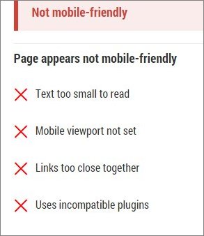
Below that disconcerting message was a graphic of how the site appeared to mobile users.
Mobile unfriendly, indeed!
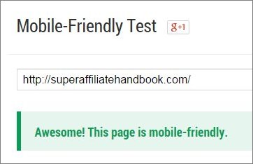
It was immediately apparent to me that all the design tweaks I'd made were the culprit, so I quickly downloaded and then installed a new theme (Focus Pro by StudioPress).
After running a second site test, this nice message appeared:
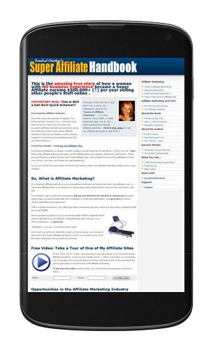
And this is how the homepage looked on a mobile device:
I wasn't keen on the fact that the whole title didn't appear in the vertical orientation, so I quickly created and uploaded a header graphic of 370 X 100, per directions included with the theme and this was the result…
MUCH better!
If your blog turns out not to be mobile-friendly, the fix could be as simple as changing the WordPress theme.
If not, there is plenty of help to be found on the Mobile-Friendly Test site, which detects which platform you are using and will direct you to the appropriate technical guide.
Anyway, here's hoping that all of your sites are friendly and that you won't have to do any tweaking this weekend!
Comments, questions or suggestions? Please leave a comment below!
Cheers,
I have my other blog. It already mobile friendly too. But after april that blog lost 50% traffic, don”t know why. I never create low quality articles and copy paste.
Thanks very much Ros.
Ran the test on our work site and
mobile is good.
Hello Rosalind,
I bought the Beautiful Pro Theme from StudioPress and the Design Palette Pro via your affiliate link. I activated both and and I ran a mobile friendly test for Eco Beauty Reviews.
I am now being advised by Google that Eco Beauty Reviews is not mobile friendly.
Any advice on how I am able to resolve this?
Thanks,
Erin
Hi Erin,
I just tested your site and it came back as Awesome! This page is mobile-friendly. ๐
Cheers,
Ros
Personally I think it’s a bit of a nonsense (like most things to do with Google).
The first version of your site was far more useful then the second, because it gave a proper overview at a glance of all the resources available on the website. The second shows only about ten words, and until you changed the graphic the design (with the logo not fitting) looked awful. Even with the change it is not as usable, even on a phone, then before.
The whole point of modern phones and tablets is that you can pinch with your fingers to expand or move around the page.
I never use ‘mobile versions’ when I am browsing the web, because they are always like the above. They are simply dumbed down versions of the original that look like they are designed for three year olds.
The change is not designed to help consumers. It is done purely because it lifts Googles click through rate on its PPC ads, and hence will raise more money for them.
The net effect for the web is to dumb it down further and create pointless work where it wasn’t required.
Hi Jason,
I hear you and I’m with ya, especially regarding not using mobile versions when using my cell phone or iPad.
The point was to make the site Google-and-mobile-friendly very quickly. I’ll make some more tweaks to enhance the mobile version of the site.
Cheers,
Ros
Hello Rosalind,
Thank you for posting this article. I was wondering why my home page bounce rate was so much higher for ecobeautyreviews.com then erinsecolist.com
I ran a mobile friendly test for both of my websites and found the blog post ‘title’ and a summary of my latest post is not showing up on the Eco Beauty Reviews home page. It certainly doesn’t look engaging.
Each website’s theme differ and I found my site loading times for Eco Beauty Reviews is much slower than Erin’s Eco List.
Do you have any suggestions on which StudioPress WordPress Theme would be a good fit for Eco Beauty Reviews? It would be ideal if I could use the same header logo that I am currently using now for Eco Beauty Reviews without having to change the size of the logo.
Looking forward to your reply. ๐
Erin
Hi Erin,
Thanks kindly for your comment!
I think your theme as it stands is quite lovely, but if you really want to get a new one — I thought the StudioPress “Beautiful Theme” would work nicely and not just because of the name, but because it has a similar feel to what you already have.
I hope that helps.
Cheers,
Ros
Great post Ros! The process is a bit different with SBI sites and although I’ve done some tweaking, I should work on it more. Thanks for the reminder!
After entering my website into the mobile friendly link the results were Awesome! This page is mobile-friendly. Thanks Ros for another very helpful tip!!
Good news for you, Teresa! ๐